
组件介绍
Alert组件几乎是组件库里必不可少的组件了,即使浏览器,也自带了一个alert,会弹出一个模态框。
但是这个模态框有点太丑了,所以各大组件库分分实现了自己的Alert组件。
当然BootstrapBlazor也不例外,同样实现了自己的Alert。
样子如下:
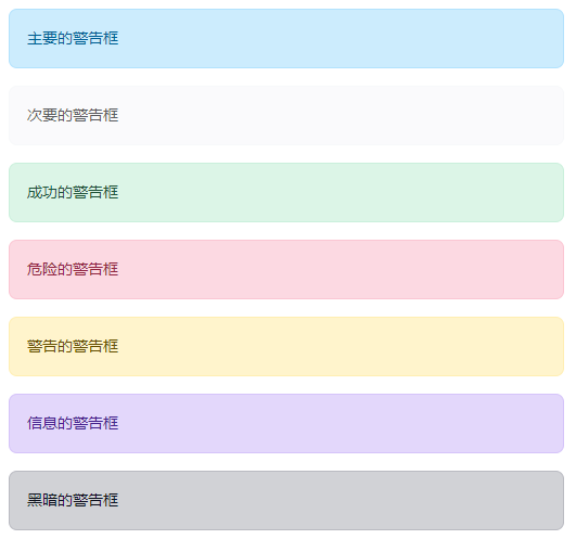
对应的代码为:
<Alert Color="Color.Primary">@AlertPrimaryText</Alert>
<Alert Color="Color.Secondary">@AlertSecondaryText</Alert>
<Alert Color="Color.Success">@AlertSuccessText</Alert>
<Alert Color="Color.Danger">@AlertDangerText</Alert>
<Alert Color="Color.Warning">@AlertWarningText</Alert>
<Alert Color="Color.Info">@AlertInfoText</Alert>
<Alert Color="Color.Dark">@AlertDarkText</Alert>
组件的其他属性
ChildContent:内容的RenderFragment,可以是简单的文本也可以是复杂的组件。所以我们可以利用警告框来实现例如强调等其他作用。
Class:额外的css样式。
Color:颜色,可选值有 Primary / Secondary / Success / Danger / Warning / Info / Dark
Icon:图标,可以直接输入FontAwasome 4.7的图标名,如fa fa-home。
ShowDismiss:显示关闭按钮。为true则会在Alert的最后显示一个关闭按钮。
OnDismiss:类型为 EventCallback<MouseEventArgs>的回调,此回调在点击关闭按钮后执行。
ShowBar:左侧显示一个Bar。
发表评论